This Gimp tutorial about architectural visualization was created by Janedo. Enjoy it!
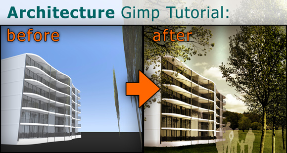
In this tutorial I want to show you my typical steps I take when I want to enhance the quality of a 3d rendered image. To get a nice architectural illustration within a short time frame I usually combine a 3d modeling and rendering tool with the possibilities of The Gimp or Photoshop. Here I want to share my approach with you.
Import 3D Architectural Rendering from Artlantis into Gimp
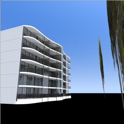
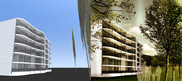
I modeled my building in AutoCAD, imported it to Artlantis to add some basic textures and lightning effects with relatively low effort. The result of this first step looks like this:
I use Gimp because the features are comparable to Adobe Photoshop, but Gimp is free! Of course if you are used to Photoshop you need some time to make the switch, but I am using it now for years and really like it.
First things first, my building looks like the tower of Pisa, and although the perspective is correct given the chosen viewpoint, it’s going to be really difficult adding trees, people, vegetation or anything else if I try to respect this angle, so I’ll start by straightening my image.
Start with Perspective Corrections in Gimp
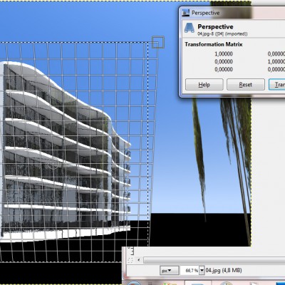
First I select with the rectangular select tool (R) the area I want to edit, and use the perspective transformation tool (shift + P) to straighten up the edges of my building.
Replacing the sky background of the 3d rendering
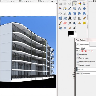
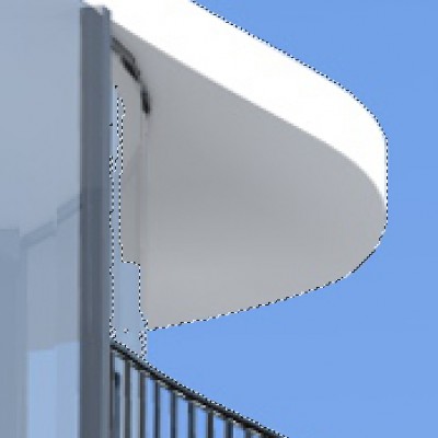
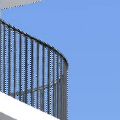
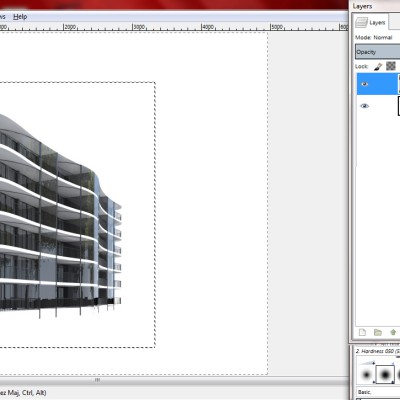
Now I’m going to get rid of the original background. As it’s all blue, it’s quite simple, all I have to do is select a region of colour with the contiguous selection tool (U), play around with the Threshold of the selection.
Sometimes the borders between the preset background and the image aren’t bold enough, so it may be necessary to zoom in an add/subtract parts to the selection (to add hold down shift and to subtract hold down ctrl).
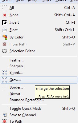
Now the background is selected. Before deleting it I like to enlarge the selection by a pixel:
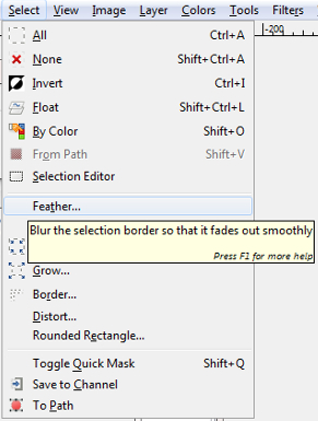
Afterwards soften it by a pixel:
This will avoid jagged edges and a thin border of background around the building. This step is VERY important. As the building is mainly white, once I lose the selection, I won’t be able to find it again, so I’m going to isolate the image from the blank background and put it onto a new layer. To do this all I have to do is invert the selection (ctrl + I), cut (ctrl + X) and paste (ctrl + V), then give the layer a new name.
Add a grass texture to the rendering
Then I am adding a background and foreground to the image using textures from our huge free texture library with over 4000 textures for architectural visualization projects. Afterwards I will correct the perspective and adding a few “flaws” to the final image that are naturally present in photos to make it realistic.
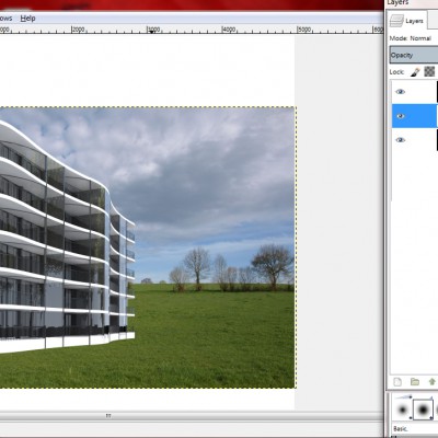
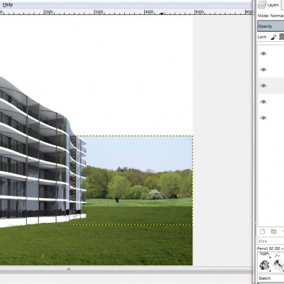
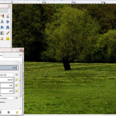
To do so I’m going to add the image I want to use for the grass. I browsed though our huge free texture library and found one nice photo with a perspective area of grass. I can open the new image as a separate layer (ctrl + alt + O), double click and drag that layer behind the building layer (underneath in the list of layers).
Now all I have to do is change the size if necessary (ctrl + T), reposition it, and delete the part I don’t want (R to select and ctrl + X to delete).
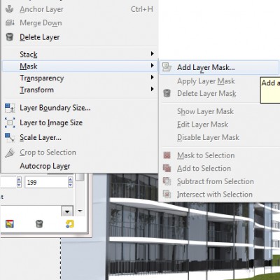
Now I am going to add some little tufts of grass to the bottom of my building, as the main thing that makes an image look fake is it’s lack of defects. You will never see a completely straight edge or a perfect shade of white in real life! So to add those little bits of grass, I have to add a mask to the layer containing the building, and this will enable me to do what I could achieve using the eraser tool, without any of the changes being permanent and therefore ruining the original image.
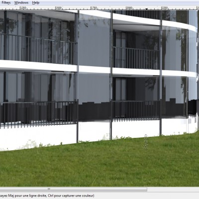
Next to the building layer, the mask has appeared. I can paint onto this mask using black, white or grey to achieve different levels of transparency (making the layer underneath, here it’s the grass, appear through the building). Just make sure to click on the mask and not the actual layer before you start painting away. I also found a brush that already looks a bit like grass, so I’m using that, varying the opacity. Don’t go over the top, as you’ll see especially later, these flaws we’re adding look most convincing when you can’t actually tell they’re there, it’s all needs to be subtle!
Adding a horizon texture to the architectural illustration
Now I’m going to add the horizon. Therefore I picked a texture of a horizon with some grass at the bottom some nice green trees and a blue sky. The next important step is to try to make the different shades of grass in both textures look nearly the same, as if it was one image.
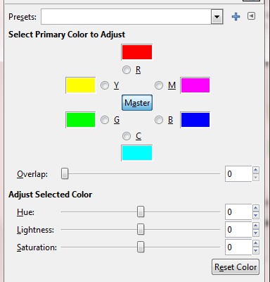
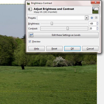
To do that I’m going to play around with the saturation, the luminosity and the contrast, but trying to get the two images to the same colour and intensity has made them rather dull, so now I have to liven them up a bit.
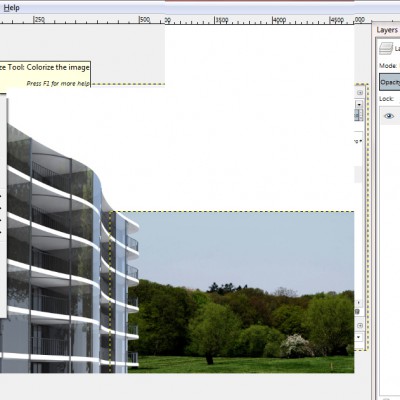
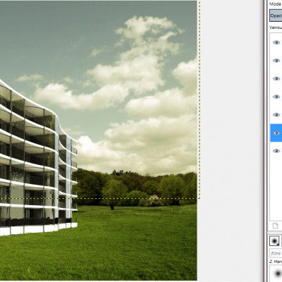
I’m gonna add a coloured filter to each of the two layers. I do this by copy and pasting a layer, and have one layer directly over the top of the other. I then change the mode of the above layer to superpose and colorify it.
Here I chose a vibrant yellow. Once I’ve done that to both layers I play around with the opacity of these filter layers to find the perfect blend, and then right click each of them and choose “flatten
down layer”. Now I’ve gone back to one layer per element, which makes things less complicated.
There’s still a discontinuity between both layers though, and for this I use the eraser tool (shift + E) with suffice and play around with size, shape and opacity again. Doing so I can make both layers blend into one another.
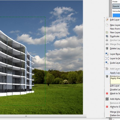
After deleting the portion of sky in the horizon that won’t be needed, I can add my chosen sky as a new layer. To simplify the list of layers even more I can apply the effect of the layer mask to the layer making it permanent.
Adding the same sort of coloured filter to the other elements of the photo can make the overall look of the image more harmoniously, especially as the colours from the original 3D rendering are very harsh and far to pure. So the sky is too dominant from my point of view so I will reduce the saturation a bit:
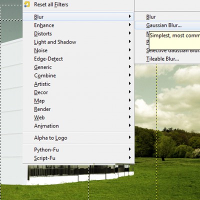
Another flaw I can add to the images is a camera focus effect. Decide on which layer of the scene you want to focus on (here I choose the background), and make the other planes (the foreground) ever so slightly blurred. Remember to feather the selection. Instead of one pixel rather go for a bigger number depending on your resolution. Here I’m in 300 dpi so I will choose 400 pixels. Then there aren’t any noticeable or abrupt transitions from clear to blurred parts of the image.
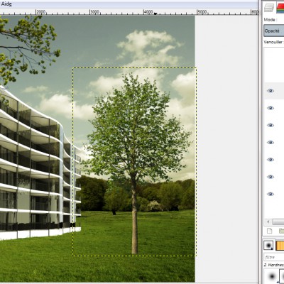
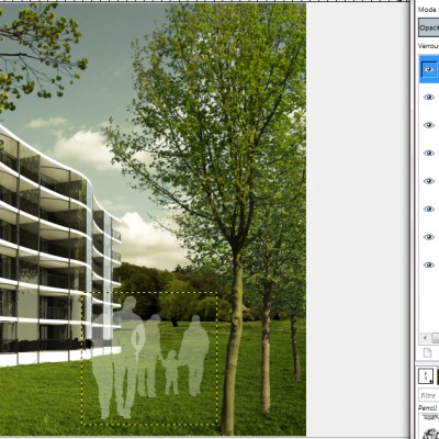
Now I’m going to add some branches and a few trees. Here I use the tonytextures trees, because they already have a transparent background, so you do not need to spend ages cutting them out. Just import them and they are ready to use and additionally come up with a pretty high resolution. Be careful about knowing where your light source comes from in the picture. Mine comes from the right side of the photo, therefore this tree needs to be flipped horizontally (layer -> transform -> horizontal mirror).
The main element of your image is the building itself! Therefore be sure that anything in front of it is slightly transparent or showcases the most attractive elements of it.
The last step (and most fun) is to add even more little imperfections to the overall image. With shift + D you can lighten or darken parts of the image, adding shadow, sunlight and effects like this. Here I lightened some of the windows, the right hand side of the trees, darkening the left side, darkened the ground around the building and the side wall that was far too white. I toned down the brightness of the branches on the left and put the contrast up on the right where the sun would hit the trees.
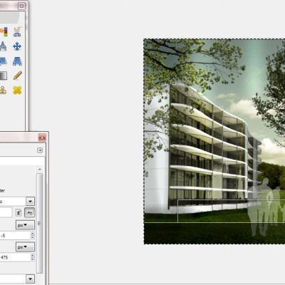
Once you’ve flattened the image you can crop it. I also added a few discreet sun glares in the sky with a simple feathered selection and a change of luminosity and contrast.
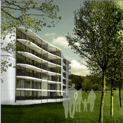
Finally: We made it! You’ve changed a cold harsh 3d rendering into a cheerful photo quality image that you can now use for your architectural presentation!
If you like it please drop me a line in the comment box!
Thank you!

Such a amazing design. Also the way to describe the design is very understandable.