
Creating photorealistic architectural renderings is not easy. You accurately model the building, set up the perfect lighting, and yet – something still feels off. Often, it’s the vegetation that breaks the illusion. Flat textures, unrealistic shadows, or mismatched colors can make even the most stunning architecture look artificial.
I recently stumbled upon an insightful YouTube tutorial from Nicolai that tackles this issue head-on. It demonstrates how to add high-quality vegetation using real photos, seamlessly blending them into your renderings. You can grab our free cutout plants and foreground vegetation elements to complete the tutorial with your rendering.
In this blog post, I’ll summarize the key takeaways and expand on them with additional tips and tricks. Here’s what you’ll learn:
- How to integrate high-resolution vegetation into your renders for a realistic look.
- Why adjusting values and colors is crucial for a cohesive scene.
- The importance of layering and composition for depth and storytelling.
- How to refine edges and transitions to avoid “pasted-on” effects.
- Best practices for a non-destructive workflow in Photoshop.
If you’ve ever struggled to make your architectural visualizations feel truly immersive, let´s try together!
Step 1: Choosing and Integrating High-Quality Vegetation
Key Points:
- Always use high-resolution photos for vegetation.
- Ensure elements match the scale and perspective of your scene.
- Use masks to integrate vegetation without affecting the building.
Adding vegetation starts with selecting the right photos. The tutorial emphasizes using high-quality images to maintain realism. Simply dragging and dropping an image isn’t enough—you need to ensure it aligns with the scene’s perspective and scale. Start by placing the vegetation elements where they naturally fit and use transformation tools to match their dimensions with the surrounding environment.
A great trick is to use masks to prevent vegetation from overlapping key architectural elements. This keeps the structure clean while allowing plants to frame the scene naturally. If you’re looking for free cut-out trees, plants, or textures, check out our free download section to enhance your renderings effortlessly.

Step 2: Adjusting Values for Seamless Integration
Key Points:
- Convert the image to black and white to focus on brightness and contrast.
- Match vegetation brightness to the surrounding elements.
- Use gradation filters to fine-tune shadows and highlights.
One of the most overlooked aspects of integrating vegetation is matching brightness and contrast. Even if a tree is perfectly cut out, if its lighting doesn’t match the rest of the scene, it will look out of place.
A useful method is to work in grayscale first. This helps you assess if the vegetation’s brightness aligns with the existing elements. If needed, use curves or brightness adjustment layers to tweak the values. The tutorial suggests using a gradation filter to subtly adjust shadows and highlights, ensuring the vegetation blends naturally with the lighting in the scene.
Step 3: Creating a Natural Atmosphere with Color Adjustments
Key Points:
- Use hue/saturation layers to match color tones.
- Check saturation levels with specialized Photoshop filters.
- Reduce saturation for overcast or diffused lighting conditions.
After adjusting brightness and contrast, color correction is the next essential step. Different vegetation images often have varying color tones, which can create an inconsistent look.
The tutorial introduces a Photoshop action tool that helps assess saturation levels across different elements. Overly saturated greens can feel artificial, especially in overcast lighting conditions. Lowering saturation slightly and ensuring uniform tones across the vegetation will make the scene feel more natural.
A pro tip: Observe reference images of similar lighting conditions. If a scene is overcast, all elements should share a muted, cooler tone. This ensures harmony in the final render.
In the comparison below, you can see that this step makes a significant contribution to achieving a coherent overall result with a special charm:

Step 4: Layering for Depth and Composition
Key Points:
- Use foreground, middle ground, and background elements to enhance depth.
- Frame the building naturally with vegetation.
- Adjust contrast based on distance (foreground = high contrast, background = low contrast).
A well-composed architectural visualization isn’t just about the building—it’s about storytelling. The tutorial emphasizes using layering techniques to create depth. Think of your render like a photograph:
- Foreground: High-contrast, detailed elements (grass, shrubs, walkway details).
- Middle ground: The architectural subject itself.
- Background: Low-contrast elements like trees and sky, fading into the distance.
By placing cut-out trees or bushes strategically, you can frame the architecture and guide the viewer’s eye toward the focal point. This principle, borrowed from photography, enhances realism and makes your renders more immersive.
Looking for free architecture staffage like trees, people, and textures? Visit our website for high-quality assets that integrate seamlessly into your visualizations.
Step 5: Refining Edges and Transitions for a Polished Look
Key Points:
- Use soft brushes to blend vegetation smoothly into the scene.
- Add a slight blur to background elements for depth.
- Use the dodge and burn tools for natural shading and highlights.
A common mistake in post-production is hard edges on vegetation, making it look artificially pasted onto the render. The tutorial recommends using soft brushes to create gradual transitions between grass, trees, and the building.
Additionally, using dodge and burn techniques on a separate layer helps refine shadows and highlights, enhancing realism. If a tree is closer to the viewer, darken the base slightly where it meets the ground to simulate shadow depth.
Final Adjustments: Cropping and Enhancing the Composition
Key Points:
- Crop strategically to enhance focus on the building.
- Adjust saturation and contrast for final refinements.
- Ensure all elements feel balanced and harmonious.
The last step is fine-tuning the composition. Sometimes, simply cropping an image can shift the focus more effectively onto the architecture. The tutorial demonstrates how to tweak saturation and contrast in the final stage to unify all elements.
At this point, your render should feel natural, cohesive, and immersive. Before wrapping up, always compare it to reference images to ensure it mimics real-world lighting and depth.
Conclusion: Bring Your Architectural Visualizations to Life
We’ve covered a lot in this guide, but the key takeaway is this: Realistic vegetation is more than just placing plants into a scene—it’s about thoughtful integration, value matching, and composition.
By following these steps:
- Choose and scale high-quality vegetation correctly.
- Adjust brightness and contrast to match the environment.
- Use color correction techniques for a natural look.
- Layer elements strategically to enhance depth.
- Refine edges and transitions for seamless integration.
Again big shoutout to Nicolai and I hope you enjoyed this video as I did!
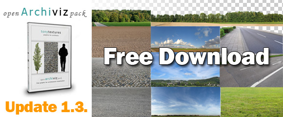
Feel free to check out our free Open ArchiVIZ Pack for high-resolution cut-out trees, textures, and more!
Let us know in the comments: What’s your biggest challenge with adding vegetation to your renders?


Leave a Reply